Showing posts with label Design. Show all posts

Wednesday, March 14, 2012

Design | Journey

I will be the first to admit that I have been l...a...z...y... when it comes to keeping this blog alive over the past couple of months. So much has happened in my personal life that it's hard to even know where to begin. Changes with family, keeping up with friends, starting an amazing new job with a design studio I love and respect, traveling, and making time for my health and well-being all while maintaining a busy freelance career... I've been tired y'all! 2012 has only just begun but it feels like I've crammed an entire years worth of activities into January, February and March. Now that I'm getting into more of a routine it feels like an appropriate time to share the things I love once more.

This particular post is a bit outside of my norm. Video games were a hobby of mine when I was younger but somewhere along the line, when games started getting almost too realistic, I started losing interest. It's funny being a graphic designer because I'm constantly interacting with new forms of technology, but with my video games I want it old school. I miss the days of Donkey Kong, Zelda, and Mario Kart. I miss my Gameboy and Super Nintendo!

I came across this article on Yahoo this morning and thought to myself, "I want to play this game like yesterday!"

Created by acclaimed independent developer thatgamecompany, Journey is an exploratory adventure that sees players wandering across a massive desert as they slowly make their way to a beacon of light atop a faraway mountain. They'll come across other online players along the way, but in what's considered a significant breach of gamer protocol, no talking is allowed, forcing players to find other ways to communicate with one another.


Even though I don't keep up with video games and reviews I will say that Journey is receiving some of the highest praise and is being considered, "The most beautiful game of its time," according to IGN.

Rainy days like today make me want to go home and whip up a pot of chicken meatball minestrone in my crock pot, bust out my roommates' PS3 and download Journey.

Tuesday, January 24, 2012

Design | Bartholomäus Traubeck: Years


YEARS from Bartholomäus Traubeck on Vimeo.

This music - which sounds like a moody piano soundtrack for a existentialist movie about a rainy day - is made by slicing a tree in cross-section, sticking it on a turntable, and dropping a tone-arm with a PlayStation Eye Camera in the head, and processing its output through Ableton Live. It’s called Years, and it was created by Bartholomäus Traubeck.

via BoingBoing

Friday, December 30, 2011

Design | Elio Di Luca

From Spanish studio Puigdemont Roca comes packaging design for Elio Di Luca chocolate. Project description from Puigdemont Roca: In a hyper-competitive market, standing out from the competition is crucial. To this end, we decided to show the basic ingredient of each flavour of premium chocolate with a fresh perspective, shooting the images from a zenith angle. In this way, we managed to convey the concept of ‘top end’, and in turn raise a range of emotions in the consumer.


via Lovely Package.

Tuesday, November 22, 2011

Design | John & John Potato Crisps

I came across this project on The Dieline but turns out they found it on Pinterest, one of my favorite new resources and websites for sharing and storing images/inspiration. John & John Potato Crisps is a hard company to find information on, particularly the studio or person responsible for the look & feel of the brand and their products. The website is bold and contemporary and the packaging is insanely stylish, but all I really know is that they're distributed by Market Grounds, a company that develops and produces food and beverage products, so perhaps they designed them in-house.


Sunday, November 20, 2011

Design | Saul Bass: Iconic Title Sequences

The legacy of legendary graphic designer Saul Bass and his iconic title sequences remains tangible to this day. Saul Bass: A Life In Film & Design, a tome dedicated to his many cultural contributions, has finally seen the light of day, and is available for purchase through Amazon.

To celebrate, Art of the Title has compiled a short homage to some of Bass’s better known works.

The Title Design of Saul Bass from Ian Albinson on Vimeo.

Friday, November 18, 2011

Design | Helios

Helios has since 1969 provided organic and environmentally friendly products to the Norwegian market. The products have traditionally been sold purely through specialty shops for organic products. Now the Helios brand is being launched to the people.

Uniform won the pitch to reposition the Helios eco-brand last year. The challenge was to transform the Helios brand from being a brand just for the typical eco-consumer, to become a brand for the regular retail customer.

Uniform has developed a new brand-positioning platform and redesigned the identity and packaging of over 100 varieties. The feedback from the supermarket chains has exceeded all expectations.

In the design process it was important to retain the historical foundation. Helios has a unique position and credibility in the eco segment with many loyal customers. The past few years, new players have entered the market, but not many producers have an equally strong history as Helios.


Through focus groups, it became clear that the name Helios had the highest recognition and was thus the most important item to keep. This gave the project freedom to rethink other aspects of the identity. Uniform redesigned the logo and gave it a prominent place on all packages in order to create a strong recognition in a chaotic grocery store. The logo underpins the importance of the name Helios – the sun god. As the packages will be placed next to well known brands it is important that Helios is evident in the shelves. With a strong and clear logo on all packages we created easy recognition across all product groups.


Different hand-drawn patterns were developed for all product lines. The patterns are based on the shape of a seed, giving associations to leaves and seeds, which supports Helios´ core values of care and naturalness. In addition fresh colors give the packages a modern look.

Common for all the products from Helios is the strong focus on ingredients and flavors. To underpin this, the ingredients will be visible in the packages where possible. Helios puts great efforts into high standards on the raw materials of their products. Together with their long history, this provides confidence and credibility with the customer. It was essential that this very focus and concern on quality was easily recognizable in the package designs.

via Lovely Package 

Monday, November 14, 2011

Design | Sunken Pedestrian Bridge in the Netherlands


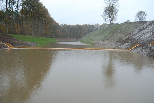
No, your eyes are not deceiving you - the waters have indeed parted! This incredible “sunken” bridge located in the Netherlands is giving visitors a unique way to access a beautiful 17th Century Dutch fort. Designed by RO & AD Architects, the Moses Bridge literally parts the waters that surround the fort, allowing pedestrians to pass through. The bridge is made from sustainable Accsys Technologies Accoya wood, which is both FSC and PEFC certified.


A series of moats and fortresses were built over the West Brabant Water Line region of the Netherlands during the 17th century in order to provide protection from invasion by France and Spain. Fort de Roovere was surrounded with a shallow moat that was too deep to march across, and too shallow for boats. In turn the earthen fort had remained protected –until now.

From afar, the Moses Bridge is invisible to the eye. The flow of the moat appears continuous, as the water level remains at the same level, reflecting the surrounding foliage. As visitors approach the fort, the bridge appears as a break in the water with its sloping walls containing it.

First lying flush with the earth, the bridge then descends deeper into the ground. Lined with wood sheet piling for walls, the deck and stairs sit between. The bridge and its components have been made from sustainable hardwood that is Cradle to Cradle Gold certified. The Accoya wood is also treated with a nontoxic coating, protecting it from fungal decay and increasing its durability — an ideal material for a sunken bridge. Like a dam, the walls of the bridge hold the waters of the moat back, and like Moses, the bridge parts the waters so that pedestrians may pass.

The Moses Bridge gives visitors a unique opportunity to pass through parted waters, to eventually meet a historic fortress of defense.

via Inhabitat

Friday, November 11, 2011

Design | JC Dark Lager


Tomat Design developed the name, logo and packaging design for a limited and personalized edition of beer brewed specially for an SPI Group company event with the participation of famous French wine-maker Jean Claude. This honored guest is a fan of yachting so Tomat decided to take this into consideration when developing the design.


via Lovely Package.

Saturday, November 5, 2011

Design | Mary & Matt: Chocolate Editions

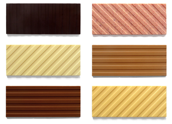
Mary Matson and Matt Even are Mary & Matt. They met in high school and began a lifelong artistic collaboration. While studying painting, they developed a love for design, food and the culinary arts. Mary worked in design and pastry, Matt in advertising. Then they began to make things they felt were missing in their life. They believe in modernism with a smile.

Chocolate Editions by Mary & Matt is a celebration of the candy bar as a perfect pop object. Launched in their home kitchen as gifts for friends and family, it quickly grew into a full line that draws its inspiration from an eclectic array of favorites -- rugby shirts, works by Sol LeWitt and David Hockney, and Neapolitan ice cream have all been reimagined as deliciously artful candies. Mary & Matt use the highest quality ingredients and craft their chocolate bars in small, handmade batches. They always have their eyes and taste buds open for new and surprising inspirations.


Saturday, October 29, 2011

Design | Peter Gronquist: The Evolution Will Be Fabulous


It was difficult finding information about this series of sculptures - The Evolution Will Be Fabulous - by artist Peter Gronquist, but based on the images and some of the reviews I found it looks and sounds like the pieces are huge, consisting of taxidermy, weapons and gilded iconic brands.


Monday, October 24, 2011

Design | Sam Kittinger: Board Games

I love the type treatment and re-design of these classic Parker Brothers board games by Baltimore based student Sam Kittinger. Makes me wish the actual games looked like this!


Of the project, Sam says, “These re-designs of classic Parker Brothers board games stemmed from a desire to de-construct the overdone packaging board games nowadays are so known for. Drawing inspiration from vintage, modernist game box designs, these re-inventions focus on simplistic imagery, experimental typography, and limited color schemes.”