Helios has since 1969 provided organic and environmentally friendly
products to the Norwegian market. The products have traditionally been
sold purely through specialty shops for organic products. Now the Helios
brand is being launched to the people.
Uniform won the pitch to reposition the Helios
eco-brand last year. The challenge was to transform the Helios brand
from being a brand just for the typical eco-consumer, to become a brand
for the regular retail customer.
Uniform has developed a new brand-positioning platform and redesigned
the identity and packaging of over 100 varieties. The feedback from the
supermarket chains has exceeded all expectations.
In the design process it was important to retain the historical
foundation. Helios has a unique position and credibility in the eco
segment with many loyal customers. The past few years, new players have
entered the market, but not many producers have an equally strong
history as Helios.
Through focus groups, it became clear that the name Helios had the
highest recognition and was thus the most important item to keep. This
gave the project freedom to rethink other aspects of the identity.
Uniform redesigned the logo and gave it a prominent place on all
packages in order to create a strong recognition in a chaotic grocery
store. The logo underpins the importance of the name Helios – the sun
god. As the packages will be placed next to well known brands it is
important that Helios is evident in the shelves. With a strong and clear
logo on all packages we created easy recognition across all product
groups.
Different hand-drawn patterns were developed for all product lines. The
patterns are based on the shape of a seed, giving associations to leaves
and seeds, which supports Helios´ core values of care and naturalness.
In addition fresh colors give the packages a modern look.
Common for all the products from Helios is the strong focus on
ingredients and flavors. To underpin this, the ingredients will be
visible in the packages where possible. Helios puts great efforts into
high standards on the raw materials of their products. Together with
their long history, this provides confidence and credibility with the
customer. It was essential that this very focus and concern on quality
was easily recognizable in the package designs.
via Lovely Package
Showing posts with label Product. Show all posts
Friday, November 18, 2011
Friday, November 11, 2011
Design | JC Dark Lager
Tomat Design developed the name, logo and packaging design for a limited and personalized edition of beer brewed specially for an SPI Group company event with the participation of famous French wine-maker Jean Claude. This honored guest is a fan of yachting so Tomat decided to take this into consideration when developing the design.
via Lovely Package.
Labels:
Beer,
Design,
Lager,
Packaging,
Product,
Tomat Design,
Typography
Saturday, November 5, 2011
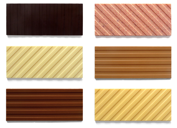
Design | Mary & Matt: Chocolate Editions
Mary Matson and Matt Even are Mary & Matt. They met in high school
and began a lifelong artistic collaboration. While studying painting,
they developed a love for design, food and the culinary arts. Mary
worked in design and pastry, Matt in advertising. Then they began to
make things they felt were missing in their life. They believe in
modernism with a smile.
Chocolate Editions by Mary & Matt is a celebration of the candy bar as a
perfect pop object. Launched in their home kitchen as gifts for friends
and family, it quickly grew into a full line that draws its inspiration
from an eclectic array of favorites -- rugby shirts, works by Sol LeWitt
and David Hockney, and Neapolitan ice cream have all been reimagined as
deliciously artful candies. Mary & Matt use the highest quality
ingredients and craft their chocolate bars in small, handmade batches.
They always have their eyes and taste buds open for new and surprising
inspirations.
Labels:
Chocolate,
Chocolate Editions,
Design,
Mary and Matt,
Product
Friday, June 3, 2011
Design | Endeavour
The Endeavour Kitchen Series is the creation of Nikolaj Kirk and Mikkel Maarbjerg, two chefs whose creativity and curiosity has earned each of them a prominent role in Danish gastronomy since the mid 90’s.
NIKOLAJ KIRK | The former head chef of several of Denmark’s leading restaurants, Nikolaj Kirk has chronicled his culinary world travels both in a series of cookbooks and in his regular appearances on Danish television.
Mikkel Maarbjerg
MIKKEL MAARBJERG | is the chef behind the success of Ensemble and Kommandanten — two of the best-reviewed restaurants in Denmark. Maarbjerg has received more Michelin stars then any other Danish chef.
THE CULINARY STUDIO | Together, they founded Kirk+Maarbjerg, a culinary studio that champions food activism through research and development, team building chef courses, product development and creative catering. Quality and esthetics - two key values of Kirk+Maarbjerg, both in and out of the kitchen - also serve as the foundation of their Endeavour Kitchen Series.
Be sure to check out the entire line of knives here!
NIKOLAJ KIRK | The former head chef of several of Denmark’s leading restaurants, Nikolaj Kirk has chronicled his culinary world travels both in a series of cookbooks and in his regular appearances on Danish television.
Mikkel Maarbjerg
MIKKEL MAARBJERG | is the chef behind the success of Ensemble and Kommandanten — two of the best-reviewed restaurants in Denmark. Maarbjerg has received more Michelin stars then any other Danish chef.
THE CULINARY STUDIO | Together, they founded Kirk+Maarbjerg, a culinary studio that champions food activism through research and development, team building chef courses, product development and creative catering. Quality and esthetics - two key values of Kirk+Maarbjerg, both in and out of the kitchen - also serve as the foundation of their Endeavour Kitchen Series.
Be sure to check out the entire line of knives here!
Subscribe to:
Posts (Atom)